Overview
Gestures are a core part of how fans navigate and interact with our product. They create a more fluid and intuitive experience by allowing fans to perform common actions without relying solely on buttons or other UI elements.
Gestures should always feel predictable, consistent, and reversible. They should never trigger unexpected actions.
Core Gestures
Swipe Left to Right: Previous Screen

Overview
Allows fans to return to the previous page or screen without tapping a back button, where appropriate (e.g. not on confirmation or irreversible action screens).
Usage
Used for primary navigation between hierarchical pages. This gesture provides a fast, intuitive way to move backward in a flow and should complement visible navigation elements.
Feedback
The current screen moves with the gesture, providing a sense of direct manipulation. A smooth transition reveals the previous screen, reinforcing the direction of navigation.
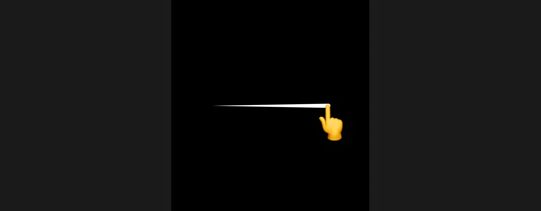
Swipe Right to Left: Next Screen (optional)
Overview
Moves the fan forward in a multi-screen flow, if applicable.
Usage
Used when forward navigation is linear and predictable. This gesture should complement visible navigation controls, not replace them.
Feedback
The current screen moves with the gesture, providing a sense of direct manipulation. A smooth transition reinforces the feeling of moving forward in the flow.
Pull Down to Refresh

Overview
Triggers a refresh or reload of content.
Usage
Used in feeds, lists, or any screen that displays live or dynamic data.
Feedback
A loading indicator is displayed during the refresh action, and the content updates once the refresh is complete.
Long Press

Overview
Reveals secondary actions or context menus. Ideal for exposing additional functionality without cluttering the main interface.
Usage
Use long press for non-primary actions that complement the main interaction. For example, triggering quick actions (e.g. share, pin, save).
Feedback
Provide immediate visual feedback on press. Show clear affordances to indicate a new layer of interaction, and if the gesture is cancelled, return to the default state with no action triggered.
Scroll to Top
Overview
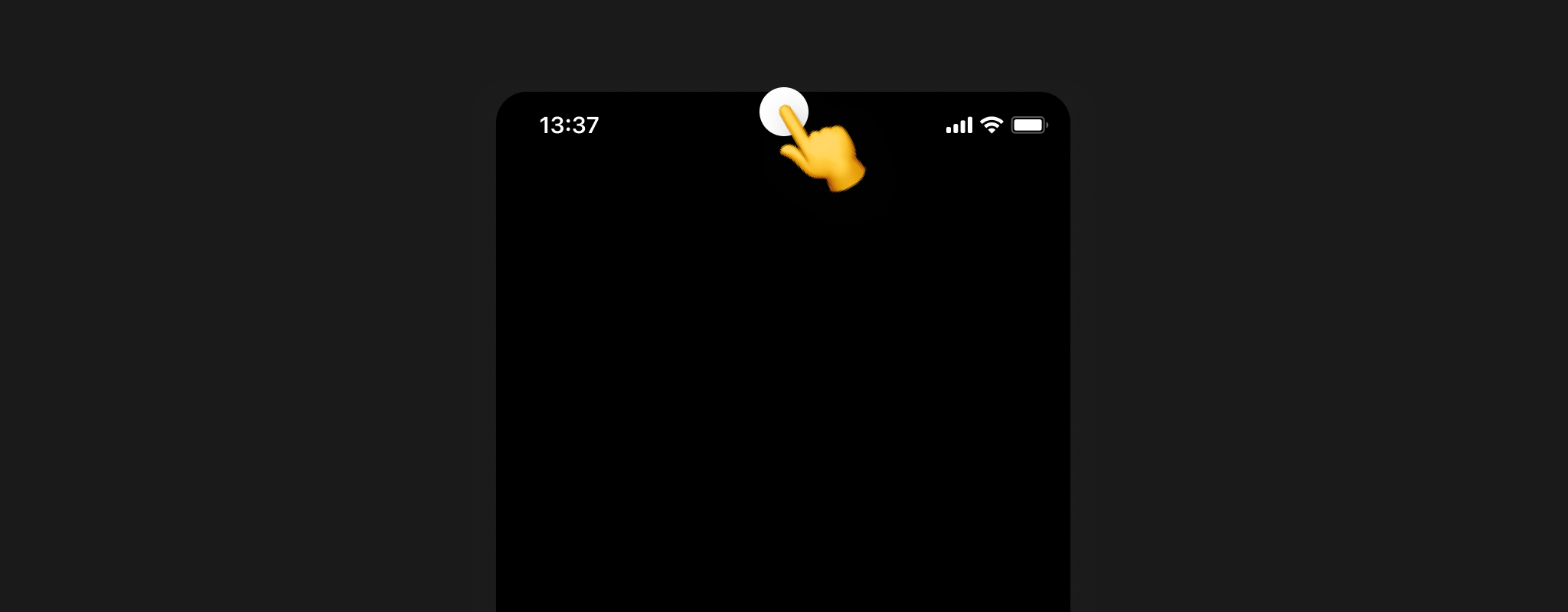
Tapping the status bar (the topmost area of the device, above the app UI) instantly scrolls the screen back to the top of the primary scroll view.
Usage
This gesture is as a supplementary way to return to the top of a long scroll.
Feedback
Scrolling to the top happens instantly and smoothly, with no additional visual effects required.
When Gestures Don’t Apply (Feature‑Driven Exceptions)
Some gestures don’t make sense or aren’t available in certain product experiences. This usually happens when the feature’s core interaction conflicts with the global gesture pattern or when gestures would lead to unexpected navigation or accidental actions.
Common Scenarios
- Full‑screen or immersive experiences: Vertical or horizontal swipes are reserved for primary navigation e.g. Vertical Containers. Other gestures may be disabled or replaced with alternative entry points.
- Modal or contained experiences: Gestures that navigate outside the container may be disabled to keep fans in context.
Best Practices
- Gestures should never replace critical UI elements, they enhance, not replace.
- Always pair gestures with clear animations or transitions to reinforce the action taken.
-
Ensure gestures don’t conflict with each other or platform-native interactions.