Design
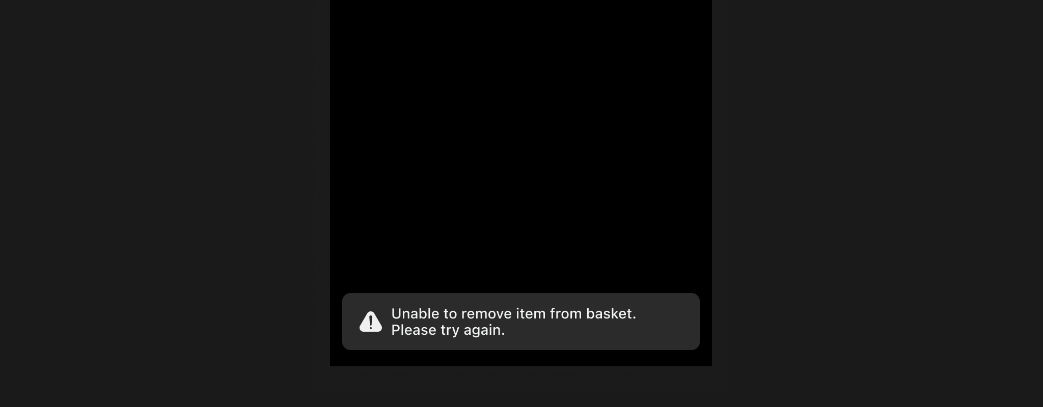
Component checklist
Overview
The Snackbar is a short message that appears at the bottom of the screen after something happens, then takes itself away. It carries a title, with an optional icon, subtitle and single action.
Usage
Placement
Snackbars appear at the bottom of the screen, usually centred horizontally above the bottom navigation or app bar. They should not overlap essential UI elements.
Icons
Icons in Snackbars provide a visual cue that complements the message, such as a checkmark for success or an exclamation mark for warnings. Icons are placed to the left of the text.
Links and actions
Snackbars typically contain a single action, such as "Close" or "View," positioned to the right of the message text.
States
Snackbars usually appear briefly and then disappear automatically, but in some cases, they may remain visible until the fan interacts with them. Persistent Snackbars should be used only when necessary.
Minimum height
A snackbar is never shorter than 54px. Without that floor, one carrying a single line of text sits too slight at the bottom of the screen to read as a notification. Above 54 it grows with its contents, so adding a subtitle makes it taller.
Design
Appearance
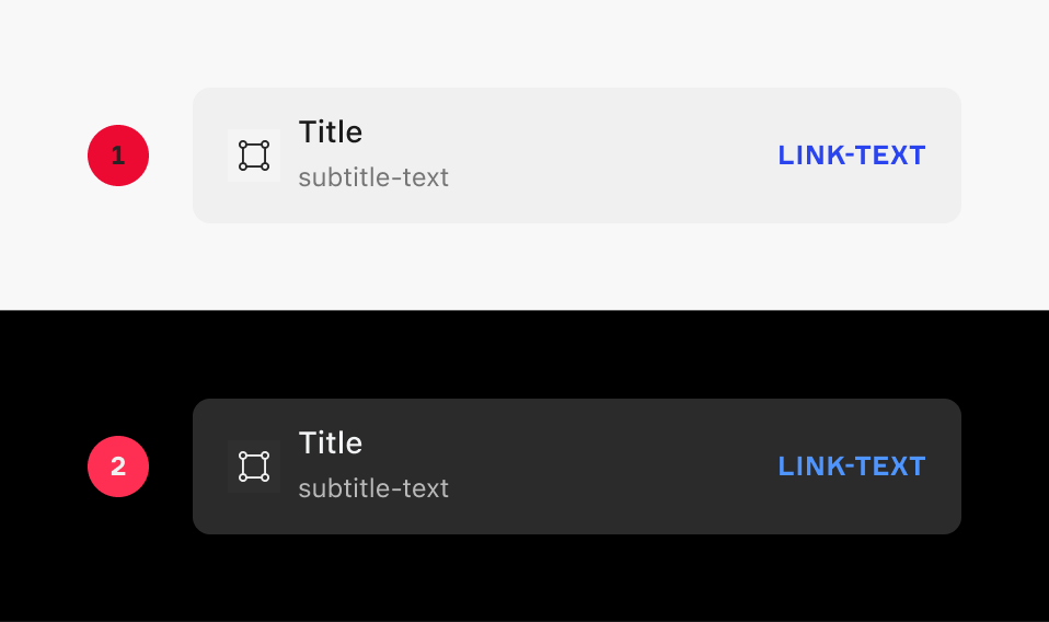
|
Item |
Usage |
|---|---|
|
1 |
Light Mode |
|
2 |
Dark Mode |
Anatomy
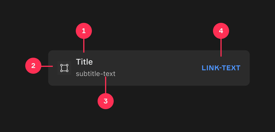
|
Item |
Usage |
|---|---|
|
1 |
Title |
|
2 |
Icon (Optional) |
|
3 |
Subtitle (Optional) |
|
4 |
Link (Optional) |
Variants
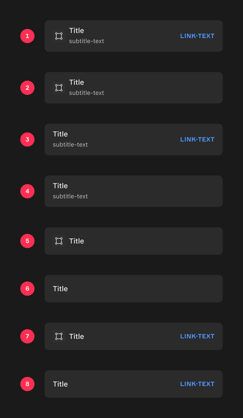
|
Item |
Variant |
|---|---|
|
1 |
Left Icon, Title, Subtitle, Right Link |
|
2 |
Left Icon, Title, Subtitle |
|
3 |
Title, Subtitle, Right Link |
|
4 |
Title, Subtitle |
|
5 |
Left Icon, Title |
|
6 |
Title |
|
7 |
Left Icon, Title, Right Link |
|
8 |
Title, Right Link |
Animation
For Snackbars that appear and disappear automatically, the duration will be 3000ms.
An Ease Out effect will be used when the Snackbar appears on the screen, and an Ease In effect when it leaves the screen. See our Motion guidelines for more information.