Design
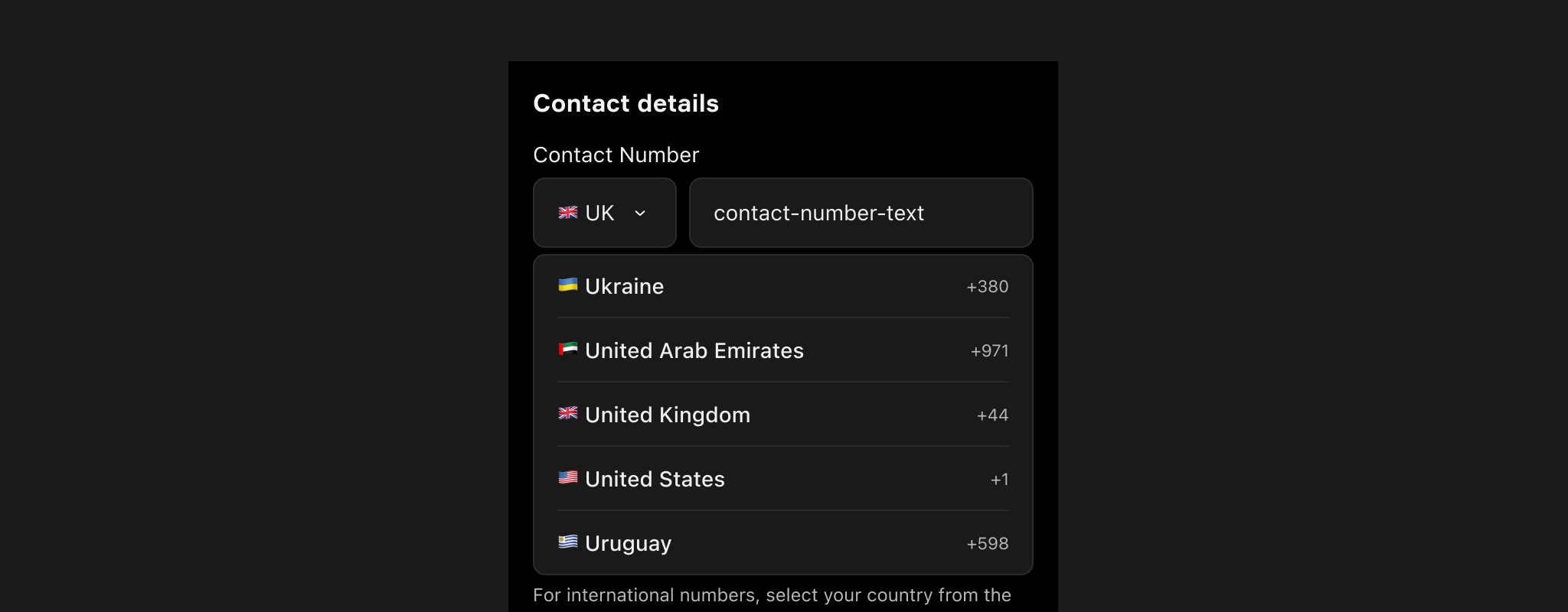
Component checklist
Overview
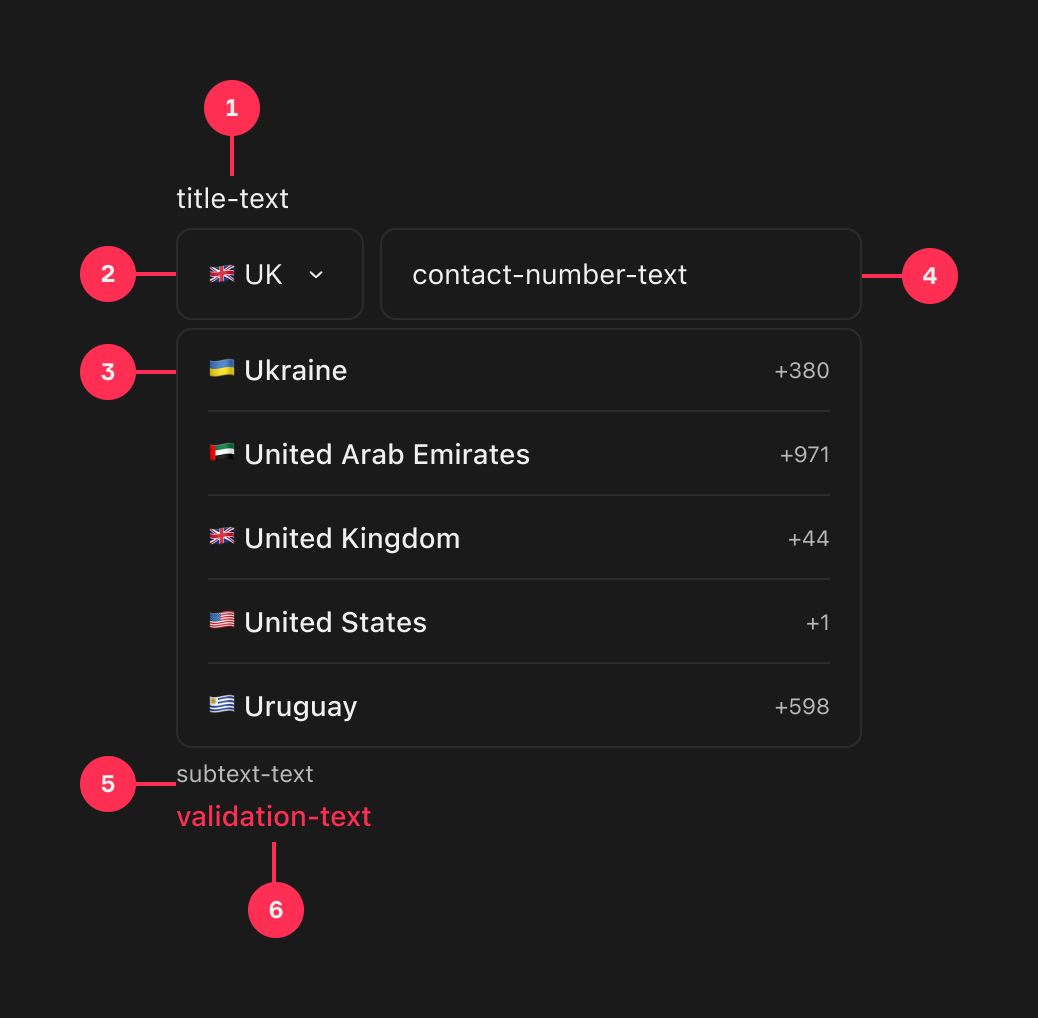
The Contact Number field lets a fan enter a phone number alongside a country code picked from a list. It carries an optional title, the dropdown and text input, with optional subtext and validation text beneath.
Usage
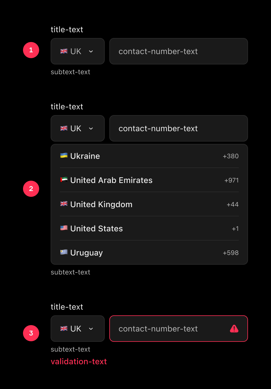
States
Default
Used when the input is not currently in focus.
Menu Open
Used when the Contact Number dropdown is currently in focus.
Validation
Used when the input data is not valid.
International numbers
To accommodate international telephone numbers, fans will be able to select their country code from a predefined list.
- The default selection will be based on the fan's location, displaying the most relevant country.
- If relevant, the most frequently selected countries will be displayed at the top of the list.
Validation & formatting
TBC - Pending Library Selection.
Input Masking
This component will not implement input masking to ensure fans can provide a contact number in their preferred format.
Fans should be allowed to enter telephone numbers in any format familiar to them, including the use of additional spaces.
Displaying the country code removes the need for the fan to enter a leading '0' at the start of their phone number. However, a leading '0' will still be accepted to reduce fan error.
Overflowing Text
In the event of text overflowing a text input, the default device/browser behaviour should apply.
Optional/Compulsory
In most scenarios, collecting a contact number is optional. However, there may be scenarios where it is compulsory. In such cases, the optional label will be removed.
Design
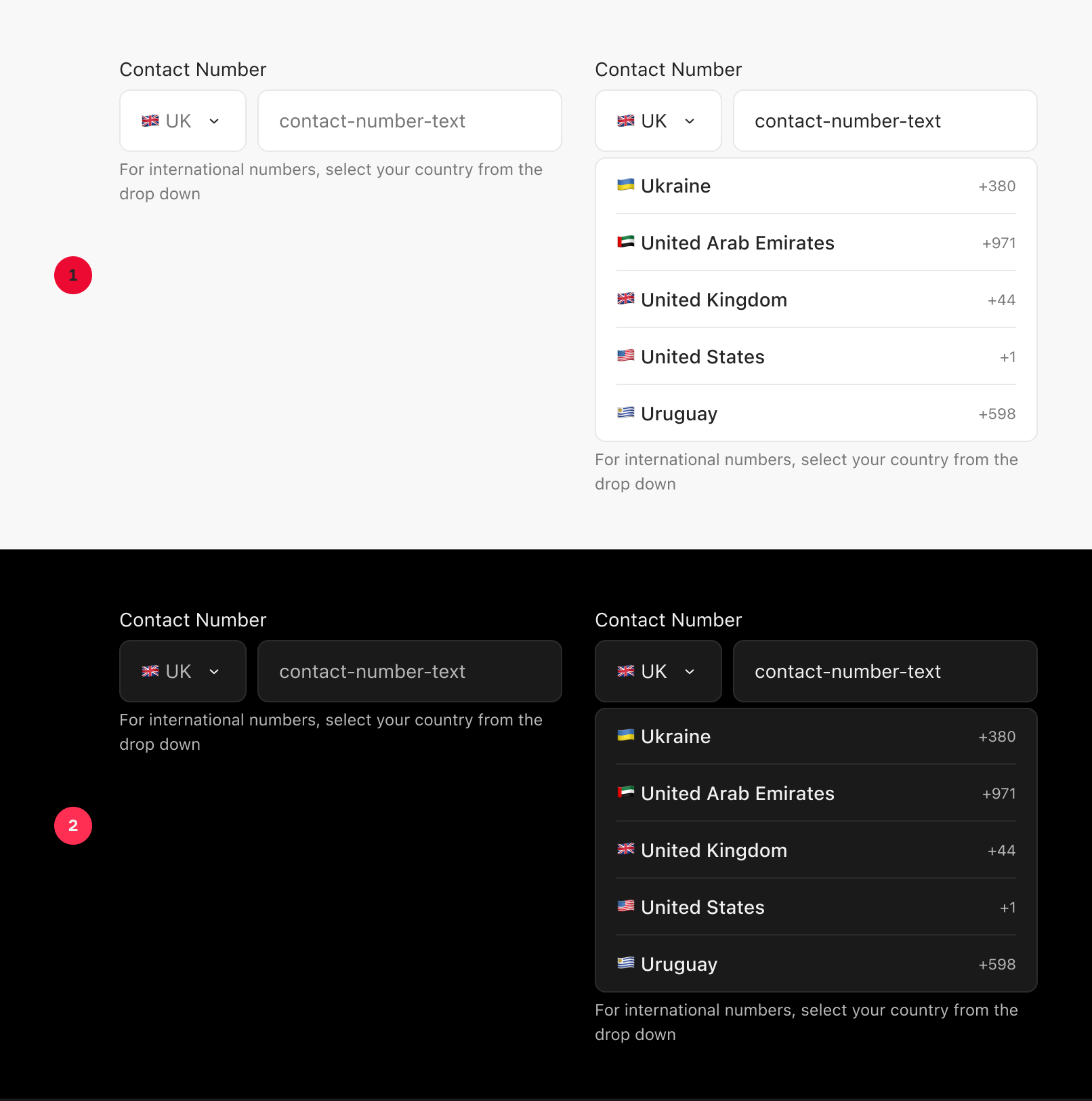
Appearance
|
Item |
Usage |
|---|---|
|
1 |
Light Mode |
|
2 |
Dark Mode |
Anatomy
|
Item |
Usage |
|---|---|
|
1 |
Title Text (Optional) |
|
2 |
Dropdown |
|
3 |
List Item |
|
4 |
Text Input |
|
5 |
Subtext Text (Optional) |
|
6 |
Validation Text (Optional) |
Variants
|
Item |
Usage |
|---|---|
|
1 |
Default |
|
2 |
Focused |
|
3 |
Validation |
|
4 |
Read Only |