Design

Component checklist
Overview
The Information component displays concise, important information in a compact block. It is non interactive, and consists of a mandatory title with an optional subtitle and icons.
Usage
Placement
Place the Information component where concise, static information needs to be emphasised, such as alerts and status updates.
Custom Content
The component supports customisable content, allowing for combinations of a title, optional subtitle, and icons that can be placed on the left, right, or both sides.
Design
Appearance
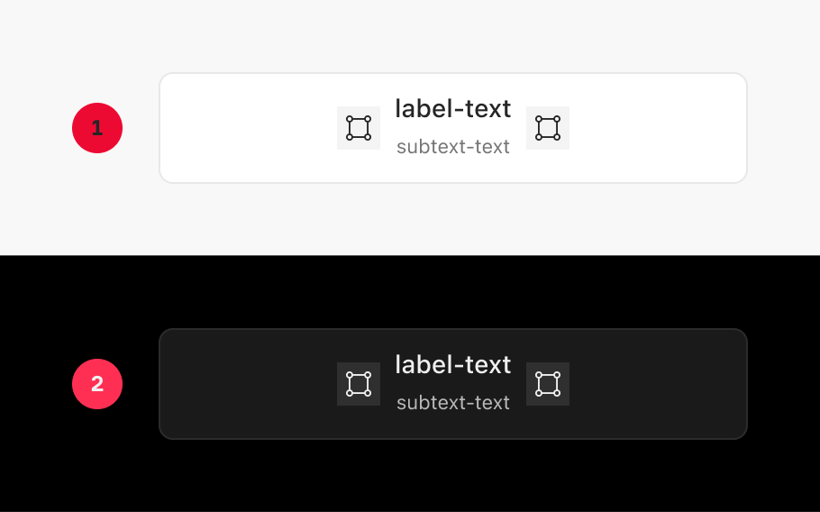
|
Item |
Usage |
|---|---|
|
1 |
Light Mode |
|
2 |
Dark Mode |
Anatomy
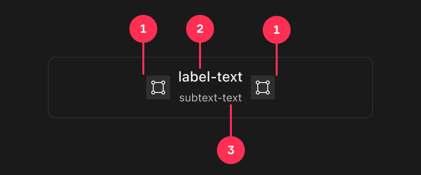
|
Item |
Usage |
|---|---|
|
1 |
Icon (Optional) |
|
2 |
Title |
|
3 |
Subtitle (Optional) |
Variants
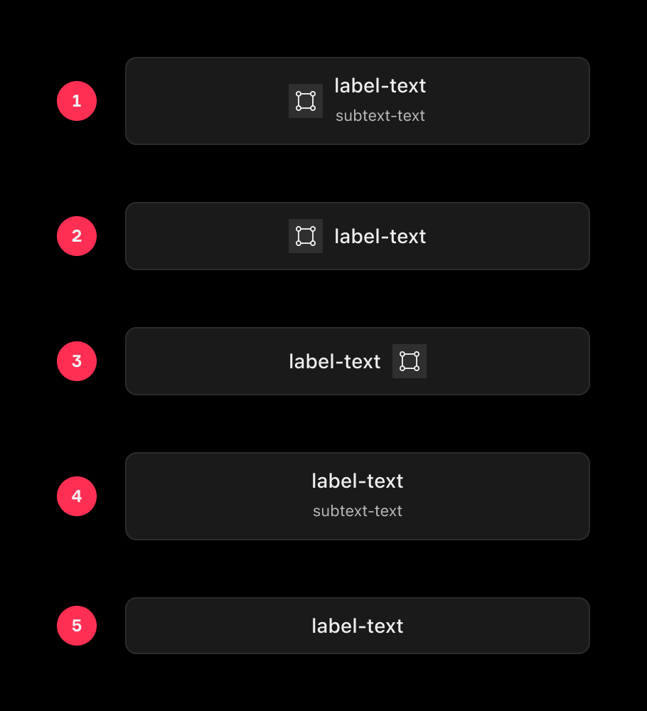
|
Item |
Usage |
|---|---|
|
1 |
Left Icon, Title, Subtitle |
|
2 |
Left Icon, Title |
|
3 |
Title, Right Icon |
|
4 |
Title, Subtitle |
|
5 |
Title |