Design
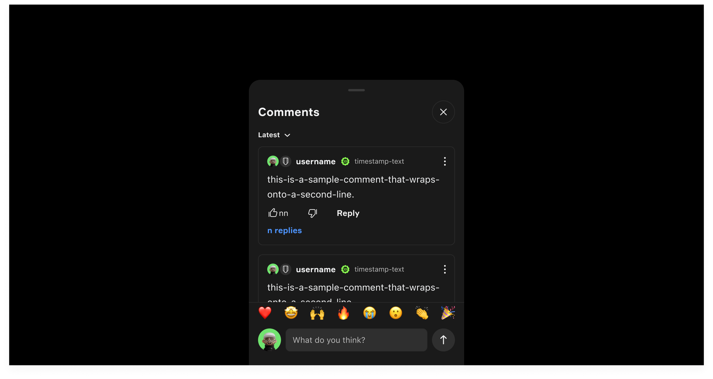
Component checklist
Overview
The Bottom Sheet is the container the whole conversation lives in. It holds the comment count and sorting at the top, the feed of Comment Cards in the middle and the Input Field pinned at the bottom, and it grows to full height as a fan reads or writes.
Usage
Structure
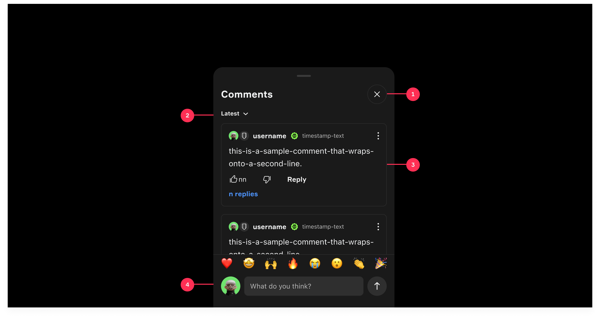
The Comments Bottom Sheet serves as the main container for social conversations and is composed of four primary sub-elements:
- Header: Displays the total comment count and a close button.
- Filter / Sorting: Allows fans to sort comments per latest and popularity.
- Comments Feed: A scrollable list of individual Comment Cards, supporting nested replies.
- Input Field: A sticky bottom area for composing new comments or replies and an emoji rail.
Component States & Transitions
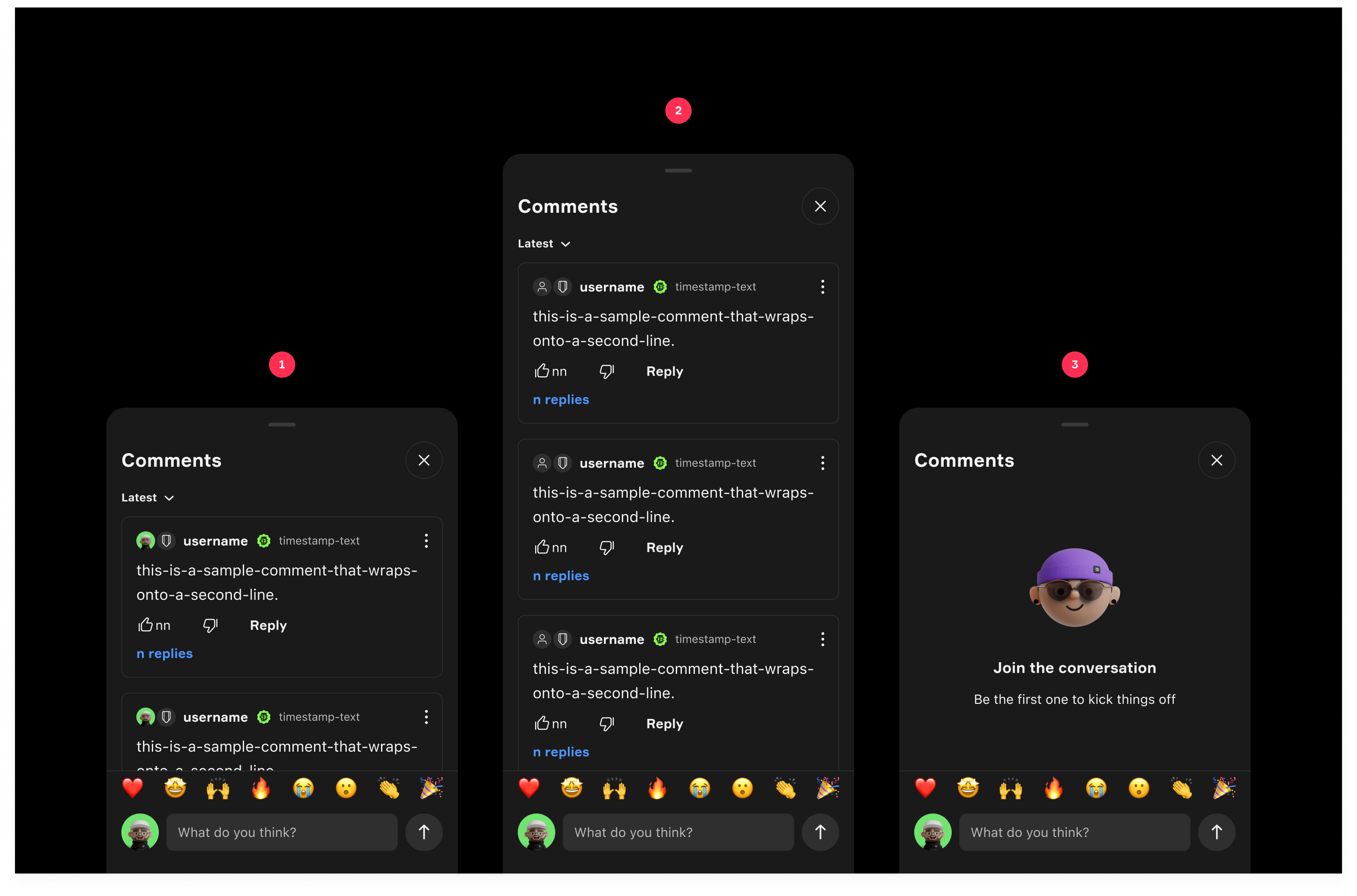
- Default State (Partial Sheet): Opens at 497px height to keep contextual background content visible while reading comments.
- Expanded State (Full Height): Smoothly expands to full height (768 px) when the fan scrolls through the comments feed or focuses on the input field to type a long message.
- Empty State: Replaces the comments feed with an illustration and copy encouraging the fan to post the first comment.
Design
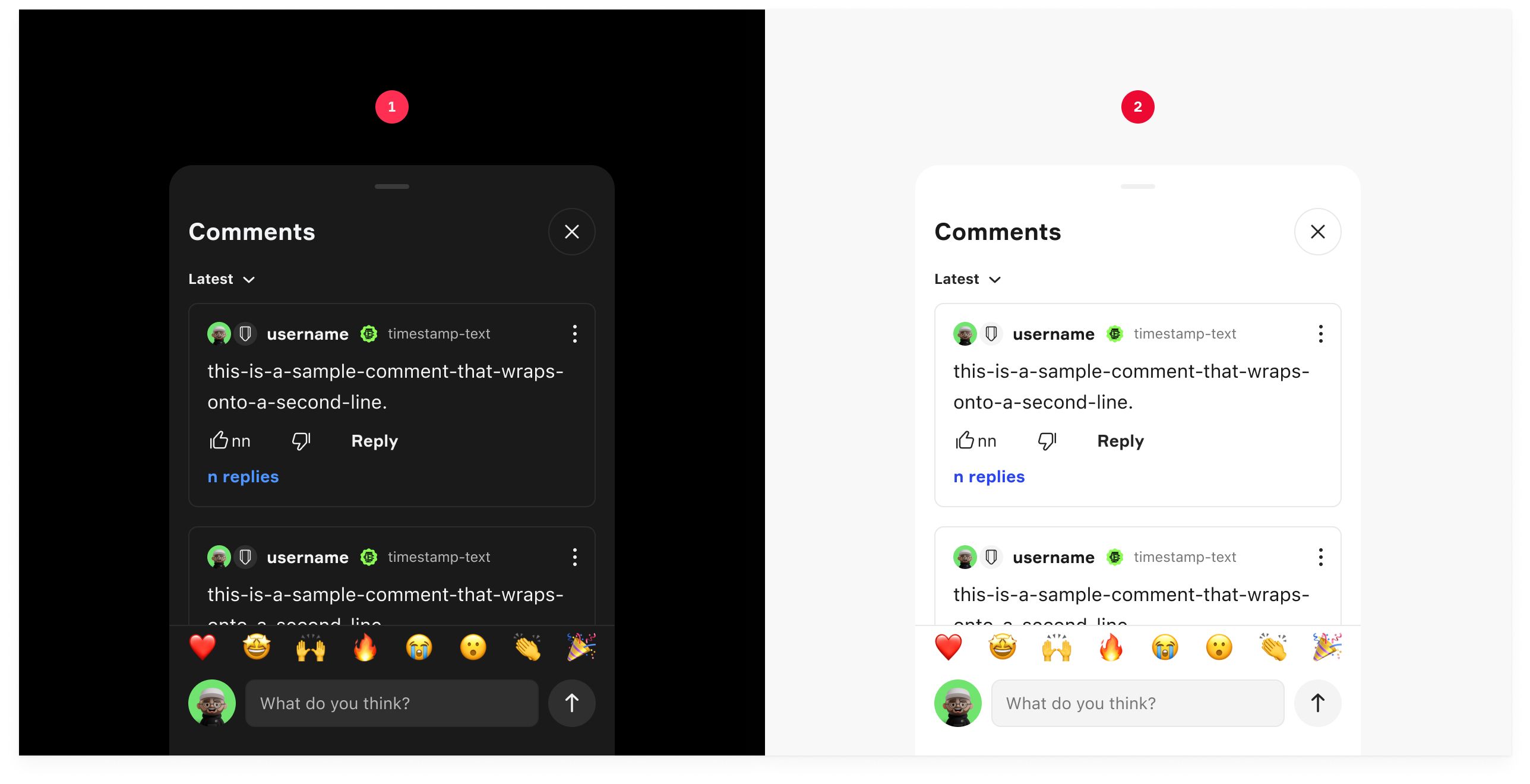
Appearance
|
Item |
Usage |
|---|---|
|
1 |
Dark Mode |
|
2 |
Light Mode |
Status
|
Item |
Usage |
|---|---|
|
1 |
Default State - On Open |
|
2 |
Expanded State - Full Height |
|
3 |
Empty State |
Anatomy
|
Item |
Usage |
|---|---|
|
1 |
Header (Title + Close Button) |
|
2 |
Sorting Filter |
|
3 |
Comments Card List |
|
4 |
Sticky Input Bar |