Design
Overview
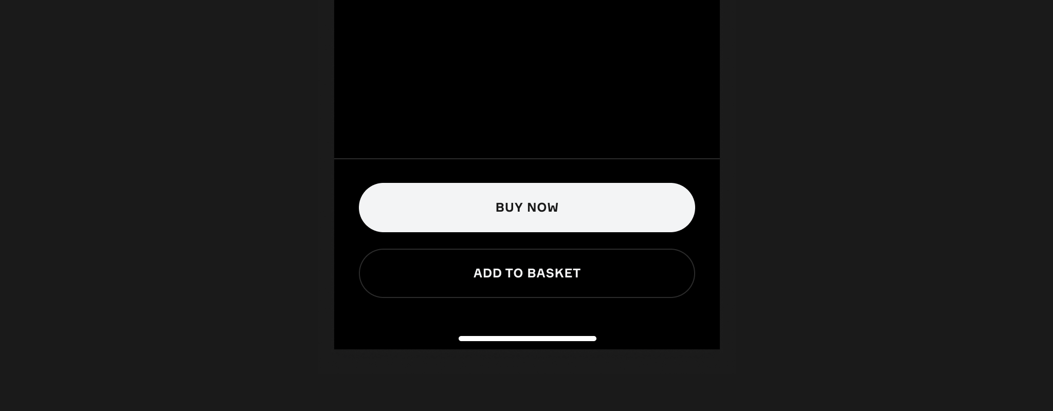
The Button is the standard action control. It pairs a label with an optional icon and comes in three levels of emphasis, so the relative importance of the actions on a screen reads at a glance.
Usage
Sizes
Our buttons are available in three sizes; small, medium, and large, offering flexibility to suit different layouts and use cases.
Types
Primary
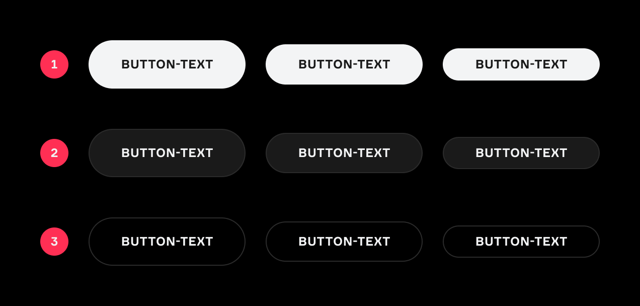
Primary buttons are designed for high-priority actions, highlighting the main task you want fans to complete, and should only appear once per screen/page.
Primary buttons feature a solid background colour for maximum emphasis.
Secondary
Secondary buttons are for medium-priority actions that support or complement the primary action. They provide alternative pathways for fans to engage or explore further.
Secondary buttons also use a solid background colour but with less emphasis than primary buttons.
Tertiary
Tertiary buttons are used for low-priority actions, offering additional options that are less prominent. They are typically subtle and support broader fan exploration.
Tertiary buttons do not have a background colour and instead inherit the colour of the parent container.
Disabled Buttons
Disabled buttons should be used sparingly, as they prevent fans from receiving feedback when attempting to engage. Whenever possible, keep buttons enabled and provide validation or guidance as needed.
Icons
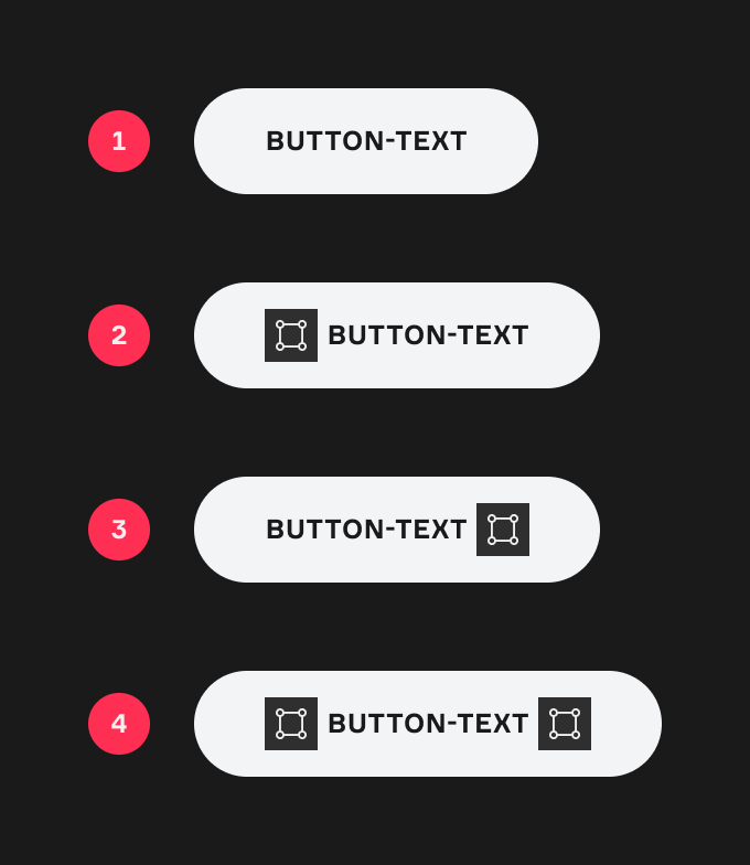
Icons should be used in buttons only when they enhance visibility or improve recognition of the button’s action.
Typically, icons are positioned to the left of the label.
Icons indicating progression or onward navigation may be placed to the right of the label.
Design
Appearance
|
Item |
Usage |
|---|---|
|
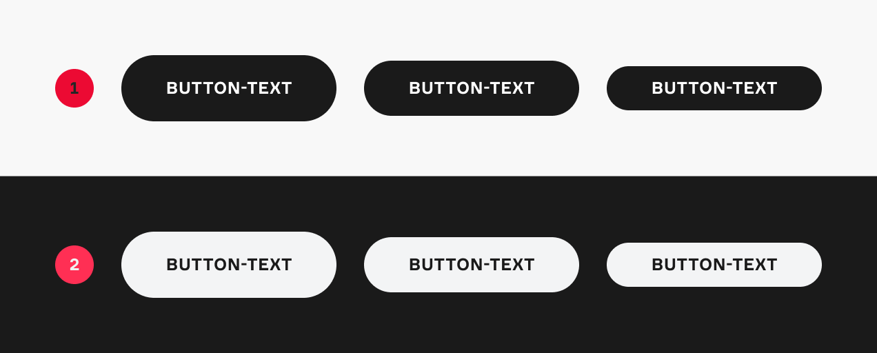
1 |
Light Mode |
|
2 |
Dark Mode |
Variants
|
Item |
Variant |
|---|---|
|
1 |
Primary |
|
2 |
Secondary |
|
3 |
Tertiary |
Icon(s)
|
Item |
Variant |
|---|---|
|
1 |
Text Only |
|
2 |
Left Icon |
|
3 |
Right Icon |
|
4 |
Both Icons |